Background
J.P. Morgan is one of the largest investment banks in the world. The bank publishes weekly content on its official website. The award-winning J.P. Morgan Research team came to my department (marketing) to enage our expertise to create an engaging digital web report about gender balance in the workplace.
Role
My role was the main (and sole) web designer, illustrator, UI animation designer and data visualization designer. I worked along a talented in-house team of developers, marketers and content writers to make this high-performing page come to live.
Project Scope
The project consists of 4 parts – web design, data visualization design, custom illutration and UI animation/interaction design.
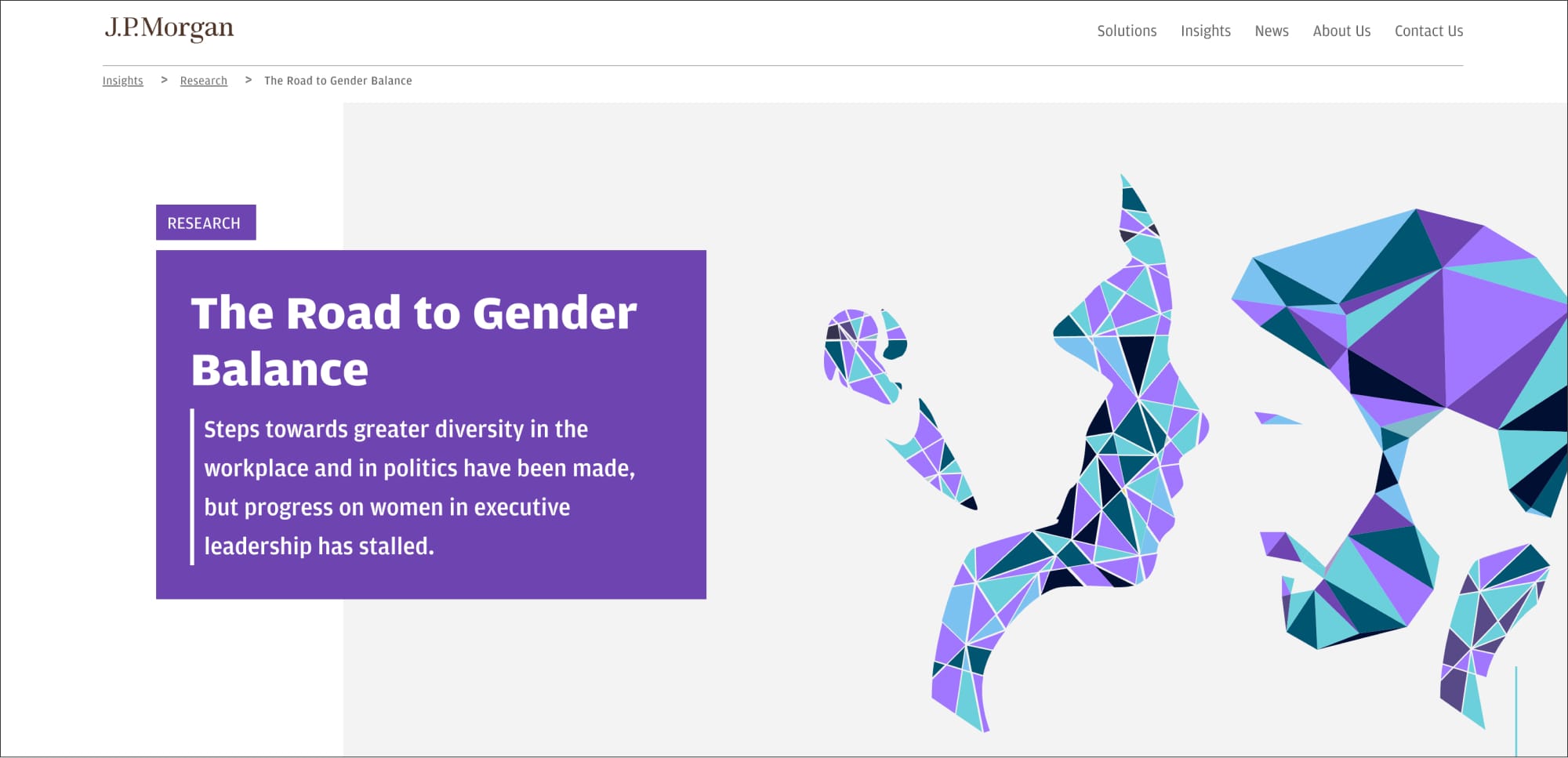
The challenge of the project is that we cannot use photography to represent genders due to considerations for inclusivity. We also cannot rely on photo-realistic or cartoonist illustrations. Our main channel for visualizing the concept of gender fell under abstract illustration. We must find a way to abstractly represent genders but also make it recognizable for the general public.
We were also challenged to represent important data mentioned in the full report in approachable manners.
Design Rationale
The constraints of no photo usage and the elimination of most stock illustrations posed an initial challenge, but I was able to quickly conceptualize and proposed the abstract gender illustration concept to the client – the award-winning J.P. Morgan Research team and quickly received approval.
I came up with an abstract mosaic-tile style of illustration that vaguely outlies androgynous characteristics of two figures who are facing each other. Since this image is critical for this page, I also designed a slow fall style of UI animation to highten the impression.
For the web design part, I used the “male/female” symbols as a decorative watermark throughout to remind readers of the theme of this report.
For data visualization, I utilized brand colors to construct clean and easy to understand bar and line charts to represent complex data.
Results/Feedback
This page has outperformed many other pages published during the same period of time. It remained one of the highest-performing pages from organic SEO years after it initially went live.