Biometric Edge is a New York-based tutoring tech company offering proprietary technology that helps students uncover hidden errors, raise scores, and help students get into great high schools and colleges.
The company website was outdated which directly resulted in conversion rate decreasing even with paid advertising. The company launched a new paid search campaign thats need a high-converting landing page design.
Based on the company’s current branding, I analyzed areas of improvement of the company’s existing site, researched the company’s competitors and defined a new visual direction based on the company’s name Biometric Edge. The slanted elements that are carried out through the new website is a direct echo to the name and its meaning – giving students a competitive edge.
Instead of overused stock photos which were populated throughout the old site, I opted for a fresh new illustrative look that is more inclusive.
Print Material
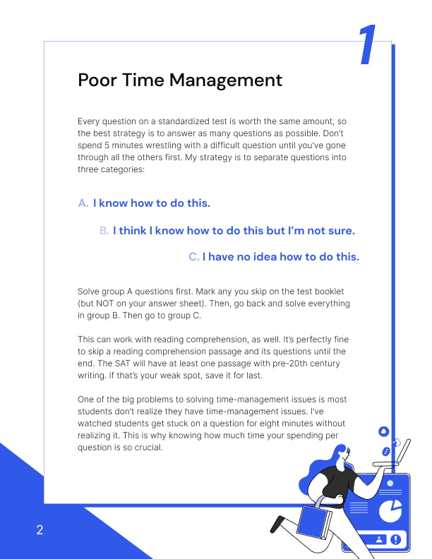
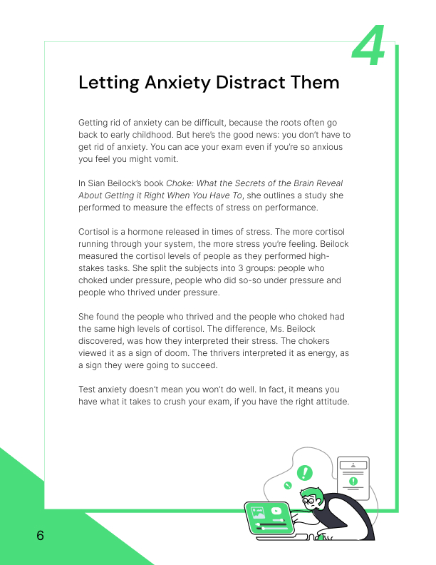
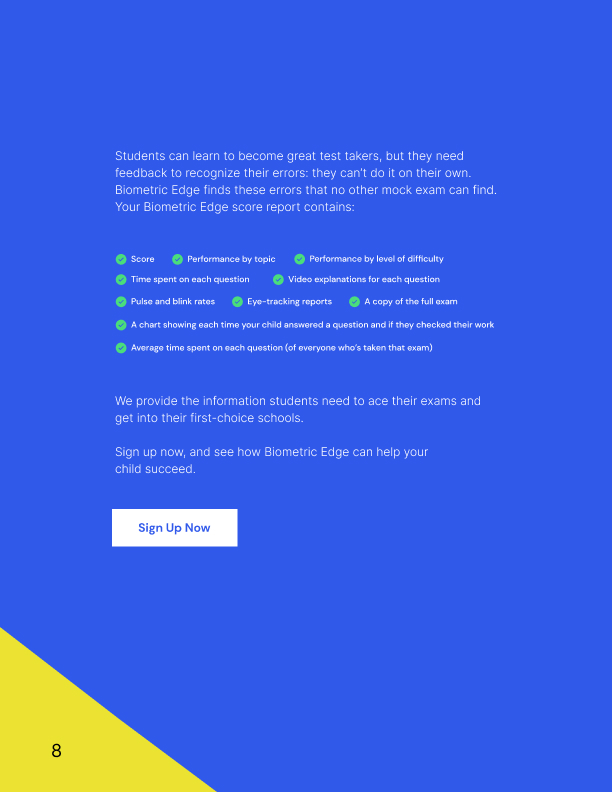
In addition to web redesign, the company also needed a print brochure design for its marketing conversion effort. Using the new visual look and feel, I designed an accompanying print brochure that gets directly delivered to potential customers who signed up via email.


