Furniture Design
Designer furniture has been synonymous with wealth and prestige for the longest time. It is out of reach for average customers who are looking for something a bit more special than mass market furniture from big retailers. What’s more problematic is the lack of functionality and comfort that comes with a lot of the unique designer furnitures that come with a high price tag.
I want to change that for design-loving furniture shoppers. Great design doesn’t have to come at a price that is out of reach for so many. Great design also needs to be functional, and even multi-functional for urban-dwelling professionals who must consider space-saving as one of the criteria for furniture shipping.
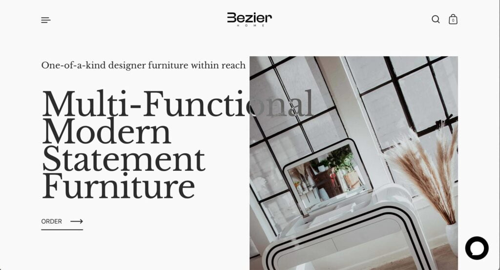
As an interior design enthusiast, I have been inspired by mid-century modern furniture design for many years. When I created Bezier Home, I wanted my brand to focus on furniture with curves. Not only are they aesthetically-pleasing but they are also safer for small children and animals.
“Bezier” comes from the term “Bezier Curves” that most graphic designers are familiar with – it refers to curvatures drawn with computer programs.
I designed my furniture to serve more than one function. Each one of my furniture item is a space-saving solution and a statement piece that brighten ups any home. I want my furniture to be memorable and a conversation piece because I believe in the power of gathering and community.
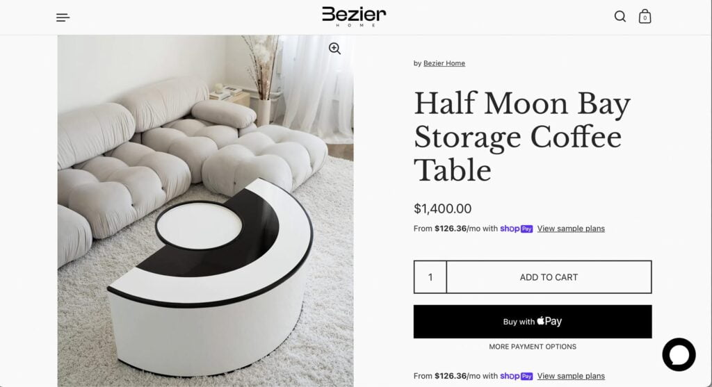
Coffee Table
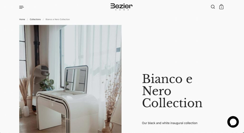
Vanity Table
Website & Brand Design
The website of Bezier Home is designed with the concept of multi-dimensionality, echoing the multifunctional design of the furniture as the brand ethos. Overlapped text and photography, in addition to elegant scroll animation, added thoughtful interactive dimensions to the overall design.
The clean black and white look of the brand’s furniture is also reflected in the brand website’s design throughout.
The logo of Bezier Home emphasized the word bezier with a letterform play on the B, which sees the letter morphed into a sideway M that resembles the curves of the brand’s furniture while the structural integrity of the letter B remains.