After working “in the field” as a visual designer for almost a decade, I started teaching design in college and vocational schools. The number one question I always get from students is — how do I build my portfolio (so I can get a job)?
I was tempted to give them the generic answers. You know, do great work; put them up on a website; design the layout nicely; write well thought out case studies; create attractive thumbnails; add some interactivity and animation, so on and so forth.
I still give these advice to students. After all, they are the basics and have to be noted and worked on. However, if we take a little “field trip” to design showcase websites like Dribbble and Behance, or award sites like Awwwards and CSS Design Awards, we’ll see the problem.
There are millions of incredibly beautiful, highly-imaginative and functional design work there. Granted a lot of them are eye-candy design concepts with no actual implementation, we can still find plenty of highly-accomplished work with real business results.
As designers, we should strive to become one of them, right?
Yes, but there is more. The problem is even if we become one of the super talented designers who produce incredible work, we are just one of them. If you spend some more time on these sites, everything starts to look the same.
…a great portfolio won’t necessarily get you work.
That is exactly how a recruiter, a hiring manager, a client feels when they have to review hundreds of thousands of portfolios. And that is why a great portfolio won’t necessarily get you work. So what does?
Establish A Unique Visual Style
I look at my own design journey and one thing consistently stood out – my personal brand has always come to people’s attention. I realized very early on that my portfolio site is probably the only project I will have complete control over and have lots of fun with. Instead of trying to look like everybody else’s beautifully minimal site, I decided to tell my own story with a visual style that speaks to my personality.
I realized very early on that my portfolio site is probably the only project I will have complete control over and have lots of fun with.
In order to create that look, I asked myself these questions:
1. What colors am I drawn to?
2. What kind of shapes and forms represent my personality well?
3. What kind of story do I want to tell?
The first two questions helped me define the graphical style of my website. I have been drawn to mid-century modern architecture and furniture design for a long time. That’s how I decided to incorporate morphing and fluid geometric shapes seen in many mid-century design as my main form.
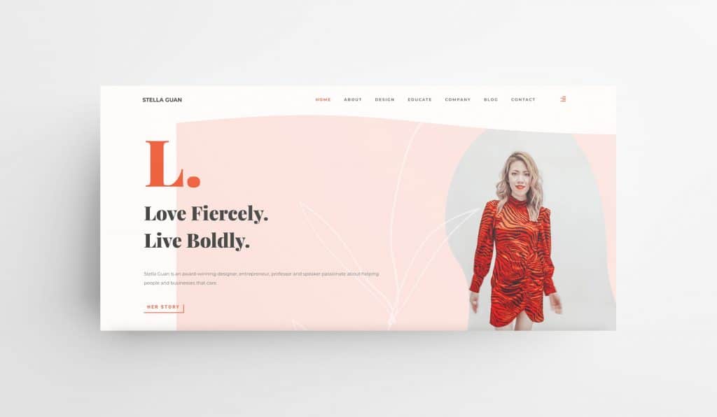
Then, I reflected on my appreciation for fashion and music from the 60s and 70s. Orange red, yellow, beige and light pink stood out to me as my main colors of choice as they represent a vintage warm tone that speaks true to my aesthetics.
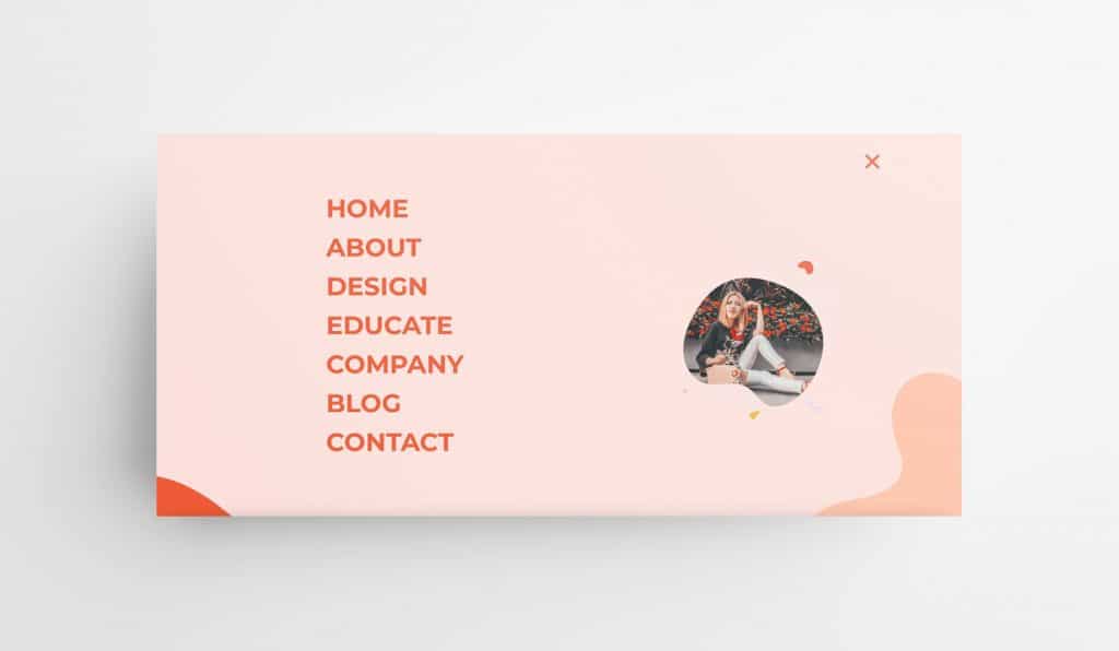
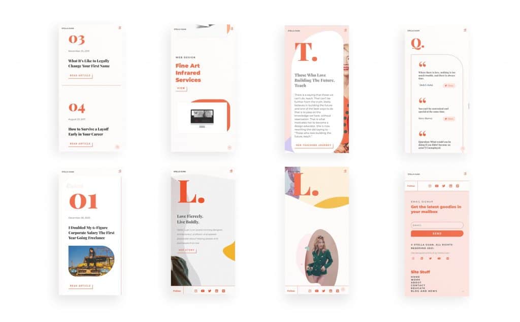
Now you may have noticed that I have quite a few photos of myself in “fancy attire” scattered throughout the site. I was certainly not building a fashion blog (despite my brief fashion journey in 2018, which resulted in some of these photos), so why did I put them up there? Knowing that it may leave the impression of me being a narcissist, I still decided to put them up there. My reason is simple – I love fashion and see personal styling as an extension of my creativity. One of the strongest personal statements we can make is to show others what we love with confidence and not apologize for it.
One of the strongest personal statements we can make is to show others what we love with confidence and not apologize for it.
It certainly took me a while to get comfortable with it – after all, I am not an extrovert. Like many people, I identify as an introvert. It wasn’t until my mid-20s when I realized the incredible power of confidence. Growing up, I hated a lot of things about myself. A few years into my professional career, I met a colleague who made it into senior roles in companies despite being much younger than me and without a college degree. Her secret was her confidence. Every interview she walked into, she was able to command it as if she already had the job. As a result, she was able to fast track her career progression. I took that as an inspiration and worked on my confidence.
Fast forward to my late twenties, I had built up enough confidence to not feel shy or embarrassed about being in front of the camera or speaking in front of a group of people. And I translated that into building my personal brand as visualized in my website.
Tell Your Story Like You Are Writing A Biopic
After I defined the visual style of my site, I decided to have a little extra fun at my about page. I told my life stories in small, interconnected snippets with a narrative tone of voice.
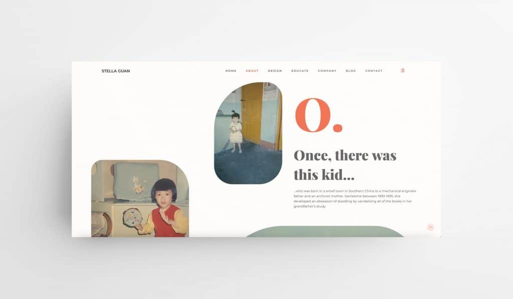
If we look at content that performs well on social media or any other platforms, we will see some commonalities among them. People love hearing stories that are relatable. They want to hear your struggles and they want to know how you did what you did, despite the struggles. Nobody wants to hear how amazing you are now.
They want to hear your struggles and they want to know how you did what you did, despite the struggles.
If we watch enough movies, we will realize that people love rooting for the underdog. The unlikely champion, the one who struggled, and the one who is a work-in-progress despite having achieved something.
Through my life experience, I also found that self-deprecation can be a quite powerful tool to connect with others emotionally. If we can laugh at ourselves, it will make it impossible for others to laugh at us (I will have to admit that I borrowed this quote from one of my favorite TV shows Scandal). What it will do is make others resonate with our flaws, mishaps and create an instant bond called shared human experience.
If we can laugh at ourselves, it will make it impossible for others to laugh at us.
With that knowledge in mind, I told my own life stories in visualized forms instead of writing a bland personal statement listing my past employers and my skill sets.
I drew from my undergraduate training in broadcast television and film. I remember my favorite college class was screenwriting taught by a hilarious but strict professor named Bill Wine, who is a renown film critic in Philadelphia. Despite having written horrible screenplays at the time, I learned how to tell stories. In retrospect, this single skill set is far more important than many others I have acquired later.
There are far too many designers who wrote statements about themselves almost like form letters. “I am a UI/UX designer based in [geo location]. I specialized in designing beautiful and user-friendly interfaces for a global roster of clients, including [name dropping a long list of impressive clients].”
While there is nothing wrong with this type of personal statements, it just doesn’t stand out. It reads empty and soulless. But if you tell people your personal stories in concise formats, they are more likely to stop for a second because it’s almost like you are presenting them with a trailer of a movie to watch. It will become a much-welcomed distraction (the good kind) from endless portfolio sites that look identical, however beautiful they might be.
If you tell people your personal stories in concise formats, they are more likely to stop for a second because it’s almost like you are presenting them with a trailer of a movie to watch.
What’s more important is that you are now showing them who they are hiring. People like to work with other people who they like as a person. And your storytelling page will convince them you are that person (or not).
People like to work with other people who they like as a person.
In fact, I have established working relationships with quite a few companies with founders who liked my stories. They didn’t even mention my work. Instead, we swapped stories about our lives and commenced the project.
We live in an interconnected world where interpersonal relationship is the bedrock of our society. People love to know how you became the person you are today. Don’t be afraid to show them.
Just as a side note, not everyone has to put up their giant faces on their website like I did. Storytelling can be done without any photos and it is up to your creativity as a designer to make that work for you.
Content Creation Is Your New Best Friend
Not every one of us is a great writer. I am certainly not one, but I write regardless.
In fact, I was extremely bad at writing at the beginning of my brief career as a TV producer before becoming a designer. I had panic attacks going to work because I was so afraid of not being able to finish my writing workload, which was about 5,000 words a day.
When I became a designer, writing became a skill set that is almost irrelevant, much to my delight. However, I realized the power of writing when my first article on Medium about my immigration experience went viral overnight. I received many comments from people sharing their struggles and inquiries about potential coaching services.
It was then when I realized that I didn’t hate writing – I hate writing on subjects that I didn’t feel passionate about and on assignment for other people. When I share my own experience, writing became enjoyable.
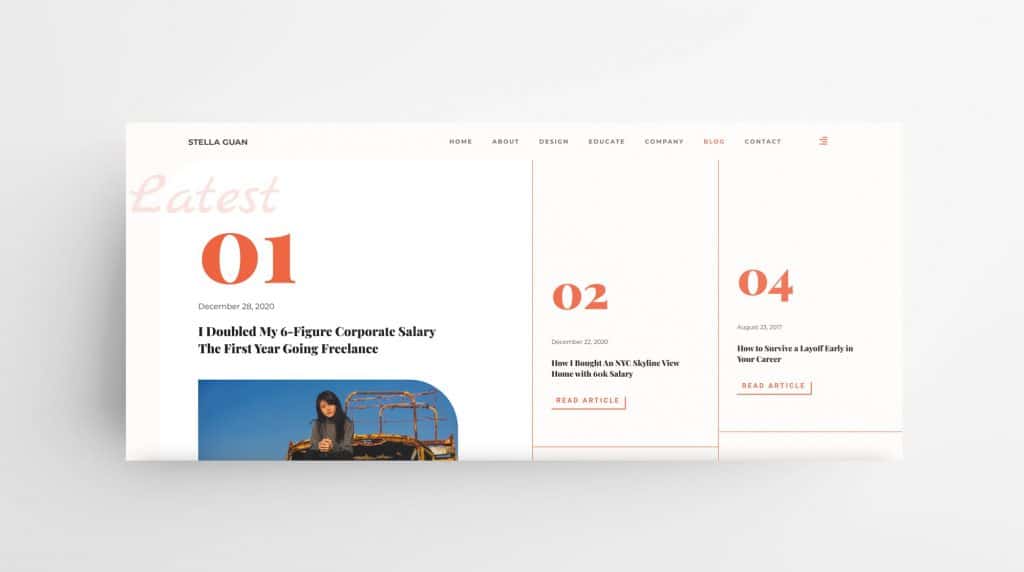
It may still not be your thing and that is okay. If you are a designer, creativity is your thing. Content creation doesn’t have to be limited to writing. You can produce informative videos; reorganize your old work as sharable social posts; produce a podcast; get on event panels and share your expertise to inspire others and learn from them.
The possibilities are limitless. The question is, are you actually going to do it? Getting started is the hardest thing and I am guilty of procrastination as everybody else, as correctly pointed out by my mother.
There is a reason that some of the most successful designers and other creative professionals don’t work for other companies. They work for themselves by establishing a strong personal brand. They share their work and thoughts consistently; they built an audience over time; they reach out and stay connected; and the work starts coming and keeps coming.
There is a reason that some of the most successful designers and other creative professionals don’t work for other companies.
When you doubt whether or not you should start a blog, create content and be active on social media as part of your brand building routine, ask yourself this question – do you want to be someone who doesn’t depend on one paycheck? If you do, you have to get started creating content and sharing today.
Instead of Making New Year’s Resolution, Do This
I noticed a trend that happens when some designers became gainfully employed, they stopped updating their portfolio sites. In fact, I have seen designers who haven’t updated their sites in 20 years. You can imagine the result, visually or technologically, wasn’t very good. If you haven’t updated a house in 20 years, no matter how great it was back then, it is now a fixer upper ready to be bought dirt cheap by an investor.
Do you really want to be that house? I know I’d rather be the other house down the block that’s well-maintained with timely updates that will sell like a hotcake.
It’s the same for your personal brand as manifested in your website. The more you slack off on updating, the more overwhelming it will be when you do eventually update it either for new job opportunities or other reasons.
Another reason, perhaps a more important one, is that if you don’t reassess your brand every year, you are not setting yourself up for progress in the new year.
If you don’t reassess your brand every year, you are not setting yourself up for progress in the new year.
Just because I am using my own site as a case study in this article doesn’t mean that my work is done. I know I will be making changes and there is always something I can improve or change.
Instead of making a New Year’s resolution list, I have set up a new ritual to update my personal brand every year before December 31. This year, I’m happy to say I did just that.
Your Work Does Not Speak For Itself
When you do all of the above, you will start having something called a “personal brand.” It doesn’t mean anything tangible or specific – rather, it is the synergy that you created by crafting a message about yourself visually and with words. That synergy will draw people who share the same value and interests as you to your side. They will become your clients, customers, business partners, followers and friends.
The power of a personal brand is that if people love hearing from you, they will buy what you sell.
The power of a personal brand is that if people love hearing from you, they will buy what you sell.
I am a strong believer in that your “work does not speak for itself.” Here is why.
When designers were think their work speak for themselves, they are actually setting themselves up for commercial failure. Instead of letting the work do the talking, we need to do the work well and then talk about them, a lot.
Instead of letting the work do the talking, we need to do the work well and then talk about them, a lot.
Next time you look for a job, projects or clients, don’t show them your portfolio. Have your portfolio embedded in your personal brand.
To wrap up, I’d like to share a few examples of designers and professionals from other disciplines who have great personal brands.
1. Timothy Goodman
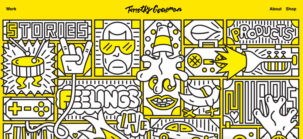
Timothy Goodman is a New York-based illustrator, designer, muralist and artist running his own studio. His work has appeared in numerous publications, merchandise for brands and public spaces. He is known for being very open in sharing his personal life and his social activism. His brand is a good example that you don’t have to put your face up in the homepage to have a strong brand.
2. Marie Forleo
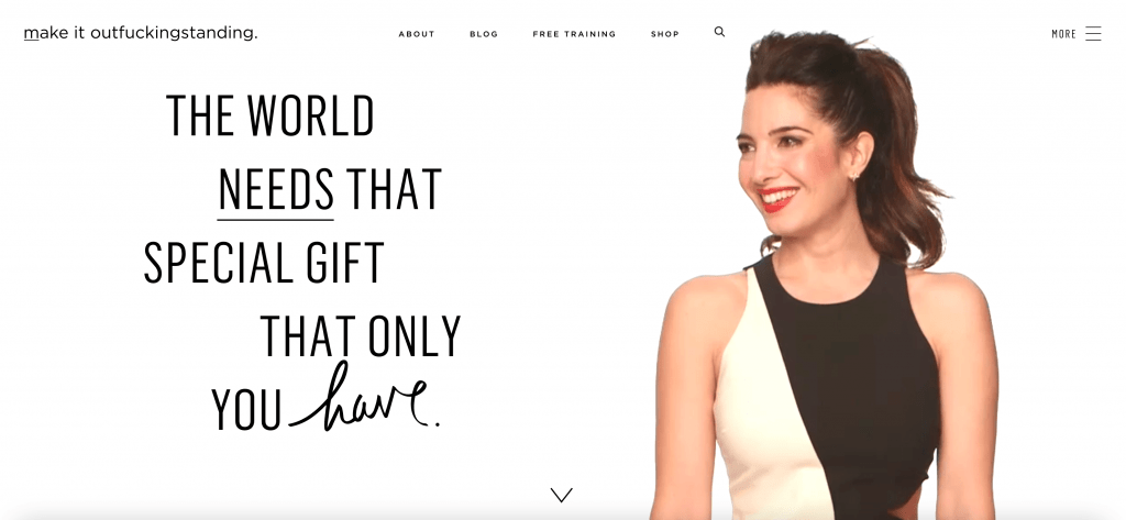
Marie Forleo is not a designer. She is a successful businesswoman who runs multiple coaching businesses. Her personal brand stands out with a clean visual look and her purposeful brand message. As we craft our stories, we can look to Marie for inspiration on how she connects with her audience.
3. Ankit Bhatnagar
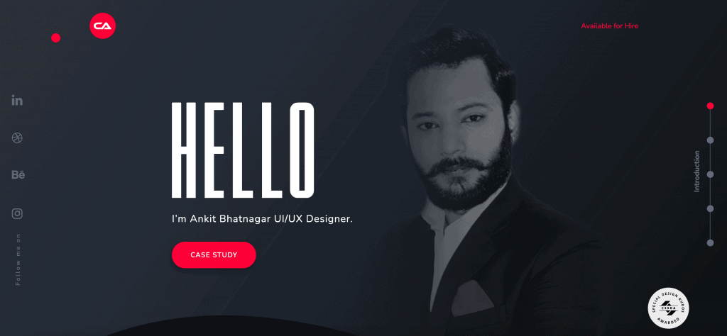
Ankit Bhatnagar is a UI/UX designer with a great personal brand. He keeps it simple but highly-effective in showcasing his skill sets while giving you a glimpse of who he is as a person. He does not lean heavy on the story telling side, but his visual branding makes his site a lot more interesting than a simple white minimal template with a collection of work in it.
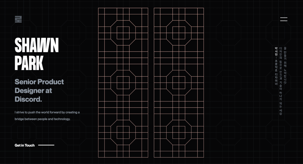
4. Shawn Park
Shawn Park is a product designer. He did an excellent showcase of his portfolio redesign journey that reaffirms our understanding of its importance. His site also stands out because he artfully incorporates cultural elements of his Korean heritage without making them overwhelm his design work.
