Web Design
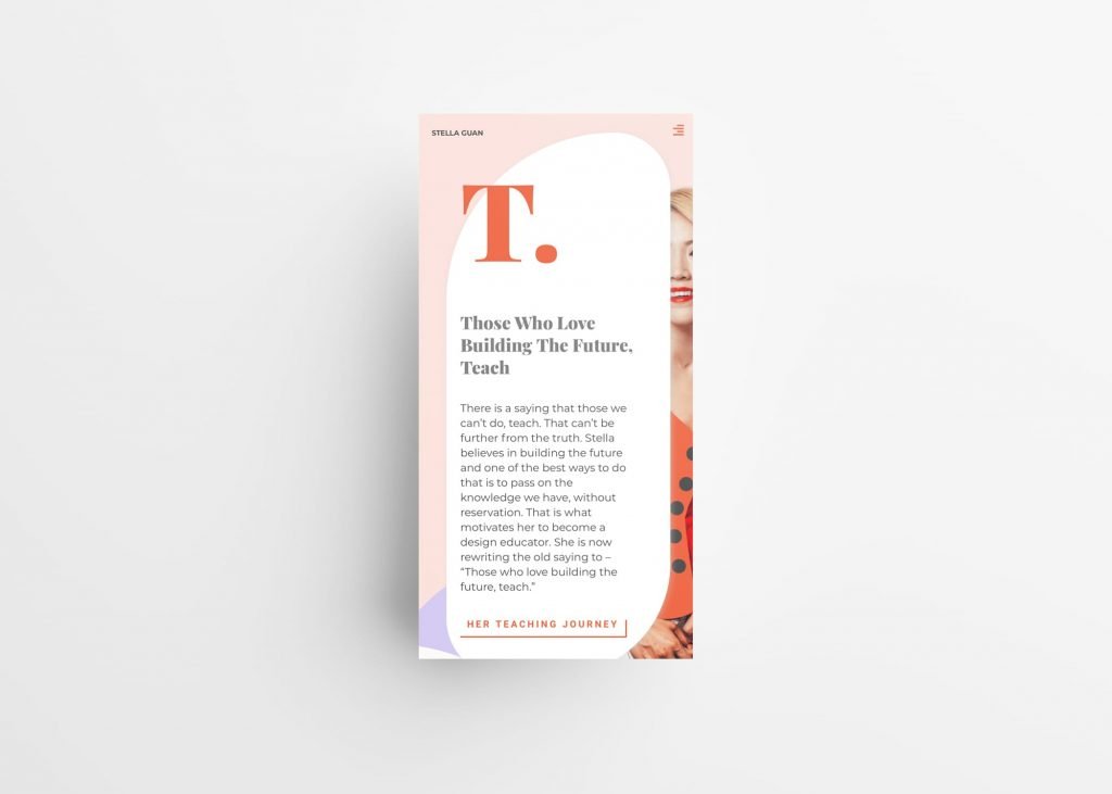
The Stella Guan portfolio website sets its visual tone as warm, vintage and fashion magazine-like. Rebrand initiatives included positioning the brand’s color palette to focus on the orange-red color as the primary brand color with a number of supporting secondary colors, including red beige, yellow and pink.
The brand typography consists of an elegant serif display font as Level 1 headings – Playfair Display and the versatile san serif Montseratt as the body text font and secondary heading font.
There are multiple morphing fluid shapes scattered across the website as framing mechanisms. There are also several hand-drawn plant illustrations as an accent element that flows through the site in the background.
Big drop cap-like letters are used in the beginning of important sections as a lead element. To increase engagement, the letters move downwards as users scroll, eclipsing the content below as users finish reading it.
Mobile Experience
The website is designed to be responsive across different devices. Each section has been optimized to compositions that are aesthetically-pleasing in mobile devices. Animations are retained with minor adjustments of positioning for certain elements to make them easier for the mobile experience.